Rebranding: The New Logo
/
Never in my life have I ever had a crush on a typeface. Until this year.
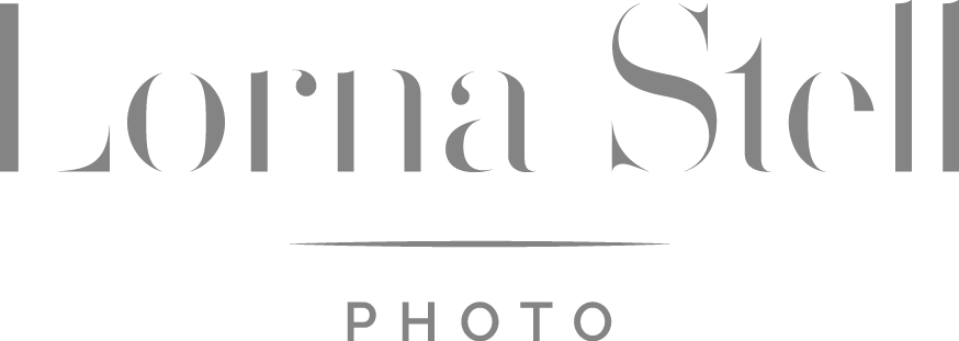
As I pinned All The Things to my Pinterest board dedicated to rebranding, I discovered an image of a word. The word itself didn’t matter so much, but what it looked like, the typeface it was set in, was just beautiful. Did you catch the little image of the word "go" in my moodboard? That's it!
I kept looking around at other typefaces to see what else was out there and what spoke to me, but nothing else seemed to quite fit the image in my head (which wasn’t totally clear, to be honest). There are qualities I enjoy about some classic serif typefaces (“serifs” are those extra little lines that come off of some letters at the end of a stroke. Think Times New Roman.) but I also love the sleek and clean appearance of some modern typefaces.
I was finding it hard to choose between the two when it came to thinking about what the basis of my new logo would be. We both know modern is totally my style, but I also wanted to bring in something that spoke to sophistication with a touch of luxuriousness. I love my usual minimalism, but I wanted something with a little more “oomph” than that. Believe me, it’s hard to put words to something visual that doesn’t exist yet!
After Sara and I created a finished moodboard together for my new brand, she went off to work her magic and create logo concepts. We ended up comparing some different typefaces to see which I liked best in the logo design, and of course, I kept coming back to my first love! So, I’m excited to say you’ll get to see it in this very blog post! One of the coolest parts of this process is that it’s a paid typeface, so I scored major grownup points when I read through the typeface license, contacted the designer with technical questions, and then clicked “buy.” At least it feels that way!
Overall, Sara and I went through a couple rounds of logo revisions, and I’m happy to say we ended up in a great place! Before I share the new logo, I’ll tell you about some of my thoughts behind it first:
My Name
I strongly considered completely changing my business name (and came very close), but ultimately decided to keep doing business under my current name, and actual name in real life, Lorna Stell. Up until now, I have been doing business as “Lorna Stell | Photographer” but this has been confusing for so many people, and I have often had images credited to “Lorna Stell Photography."
I never wanted to be Lorna Stell Photography because it is such a common naming convention in the photography world, and I want to do anything but blend in. This is nothing against other photographers who go this route, but I’ve always been an individualist at heart. I have always loved my unique birth name my parents picked for me (even if lots of people have trouble spelling or pronouncing it)! So, I’ve decided to keep using my unique name, doing business as Lorna Stell Photo. This business name feels a bit more modern and a little less common, so I think it was a good compromise! What do you think?
My Symbol
Many logos have a symbol, monogram, or similar component that completes the whole concept. Again, I wanted to stand out here a little, so I chose not to go with anything that looks like a camera, an aperture, etc. Not only are there so many photographers out there in the world right now, but I think one thing that makes my photography business unique is that it’s owned, run, and represented by ME (there's only one of me, after all). If you want to work with my business, you’ll be working one-on-one with me, so I wanted to let that shine through in my logo rather than letting a camera talk for me. Of course there’s not just one right way to design photographer’s logos—Logos with cameras and apertures aren’t bad! I just personally wanted something different.
The Overall Aesthetic
Sara chose to go with a light gray in one version of the logo which I reeeally love! I was concerned with any element of the logo, like color, lines, spacing, etc, making the whole logo feel too “heavy.” In my current logo, the black in my symbol and the thickness in the width of the L and S are feeling like a bit much to me. The fact that it’s very vertical-heavy also means it tends to dominate visually more than I’d like. Overall, I wanted a new logo that felt easy on the eyes and relaxing to look at. And I think we got it!
Drumroll please!

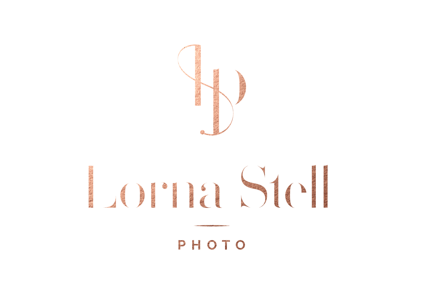
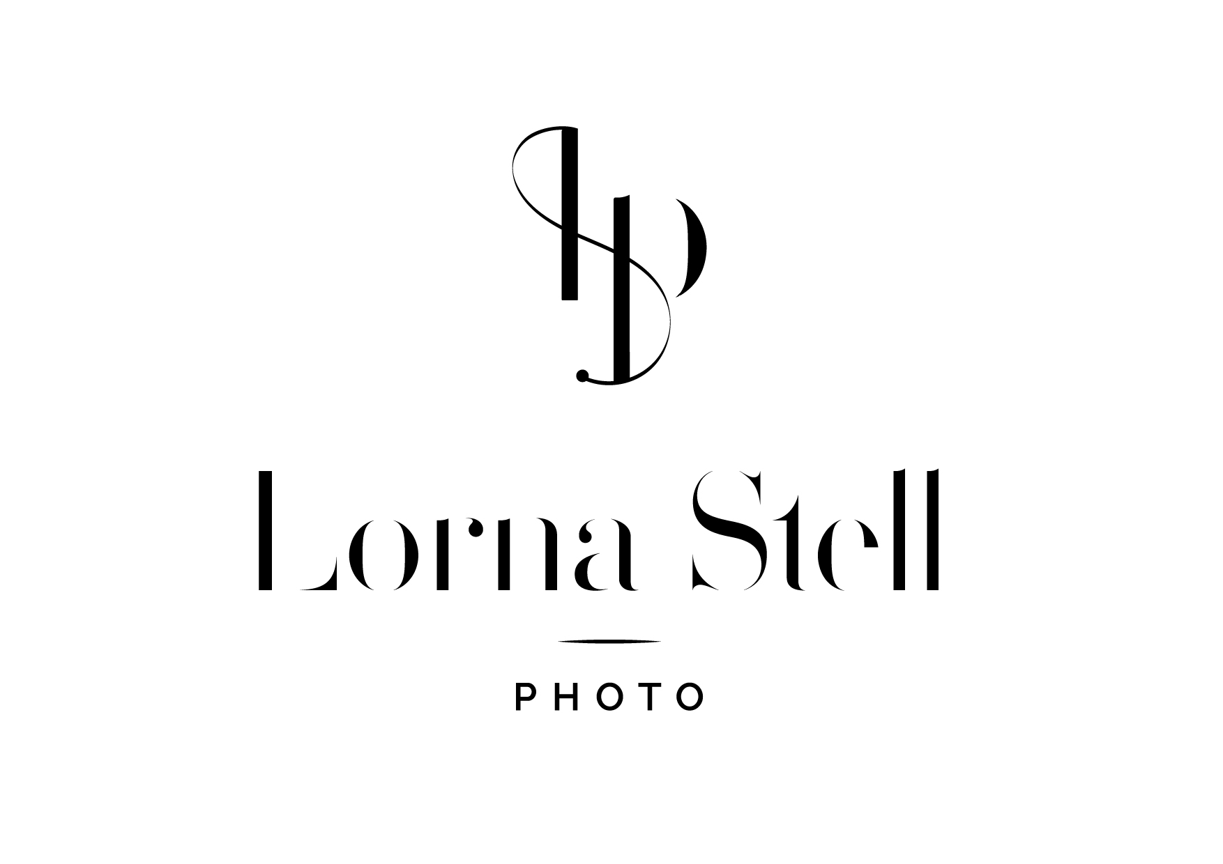
Make sure you click through the slideshow above so you can see all the different versions Sara made! It's so hard to pick a favorite, but the metallic one is gorgeous!!
The other thing I love: The symbol Sara designed reminds me of a spiral staircase for some reason! Is it just me or do you see it too? It's funny because I wasn't looking for spiral staircases as inspiration but I have always loved them and I think it totally fits my branding!
Ok, your turn! Please please share what you think of the new logo design! I'm dying to hear how you see it! To you, does it make sense with my original moodboard and keywords? I'm over the moon about this new change and I hope you are too! Leave a comment and let me know!
